Wednesday, February 6, 2008

Design Style Tutorial: GRUNGE URBAN ART

Being around with several simple tutorials about typography and general design using Photoshop, we will now move to specific design styles in a series that will continue for some time now, to start with Grunge Urban Art Style.

Before we step further, you will need sorts of design elements to create such design style. You don't have to worry, because all those design elements are actually available for free on the internet. I have great listings of Grunge Urban Art design resources just to help you to figure out what they're look like. When you use one of those resources, please credit the original designers for appreciation and read his or her design copyright before you apply them to your design.

There are certain design elements which are essential to establish a grungy vibes to your design. However, you don't need to use them all together at once, because these are just sorts of technique hints. They are:

1. Fonts and typography.
The best font type I suggest would be typewriter fonts or grunge fonts that have heavily texturized effect. Every kind of graffiti typography and industrial print alike are perfect example font styles.

2. Building or architectural background
Grunge style frequently related to urban style in particular. Urban life in the crowded city, with graffiti walls around. High rise building a photograph or the cityscape around your neighborhood will do for this purpose. Hence, you can pick: electricity towers, building construction works, or even a factory building as background or silhouette to your grunge design.

3. Color schemes
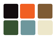
Mood in a grunge design often associated with black color. Black is a hint of power and superiority of a metropolitan society. Another dominant color that plays the role is dark grey, which is a sophisticated connotation of stone and concrete. You can find the complete color schemes suggestion in the resources lists.

4. Dirt noise textures
Creating grunge design is always been fun, because it's always associates with irregularity and erratic method. The best textures to use are splatters, blood, water colors, noise and scratch. You can apply these textures using Photoshop brush tool, or Photoshop pattern.

5. Miscellaneous vectors shape and image style
I've seen some grunge design styles that are also quite psychedelic. The common trends could have been light beams background shapes. A grunge floral vector that has erratic texture will work as well. If you need a photo or model to display, I recommend you to use pop art or line art Photoshop retouch effect.

This tutorial is just another way to create "grunge urban" design. You can find other similar Photoshop tutorials, photoshop goodies (brushes, patterns, and shapes), fonts, and vectors from other sites. If I missed something, you can just comment or even show me your own design to improve it :).

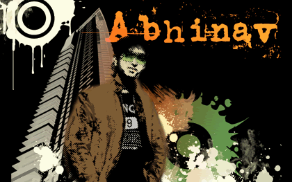
I will show you how to create grungy wallpaper. A good friend of mine, Abhinav Sood was so generous to let his photo being edited for this tutorial ;p. Thank you Abhi!

OK, Lets begin with the tutorial:


Step 1 - Choosing colors
Depends on what kind of design that you want to create, it is very crucial for you to pick several colors (4-6 hues in a colors scheme) before you add another elements. Too much variation of colors will diffuse the design emphasis. You can take a look of the color scheme option in the resources list and pick 6 maximum of them that you think would be the best color combination.
Design Style Tutorial: GRUNGE URBAN ART


Step 2 - Adding background elements
Background elements can be in the form of vector shape, photoshop brushes, or textures.
Bear in mind to always create a new layer for every object background element. The purpose of this step is nothing but to have easy customization to move, flip or rotate if you need to do it later on.

Set the different color contrast between the main object and background elements layer, as you may need to keep the visibility of main object in layers order.

Some design, would need extensive grunge background effect on a whole design workspace. There are many tutorials to create in quick way and you can also use ready made textures background such as grunge paper or hi-res vector background splatters.
But if you want to create that effect that is limited to the border or corner part of your design workspace, you can always use photoshop brushes or vectors shape.

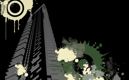
Set a new file as a primary workspace (initial workspace), and start to fill it with background elements as you wish.
Design Style Tutorial: GRUNGE URBAN ART

Design resource overview:
Magurno's vector shapes
are just marvelous, I have no reason to not to use the ready made splatters vectors which are available in photoshop vector shape and EPS format.
I also choose a superb architectural brush set of a deviant artist, *ardcor. I pick one of the available building brushes that have worm eye view perspective. My favorite!


Step 3 - Applying Special Effect
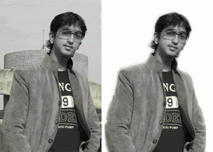
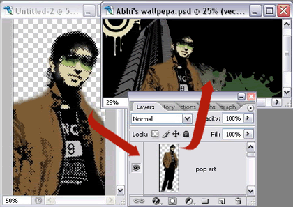
You can set any object as a main outline. Open a new file to edit it. Remove the unnecessary background then put on some special effect to the object.
Drag the finished image layer to your initial workspace. Or you can manually do the copy and paste object to duplicate that layer to the initial workspace.
Design Style Tutorial: GRUNGE URBAN ART

Design Style Tutorial: GRUNGE URBAN ART

Design resource overview:
I use pop art style to Abhinav photo. You can read how to create pop art effect tutorial in detailed version, written by Melissa Clifton.


Step 4 - Working with Fonts
Add some design styles, but be sure to avoid reflecting effect, uniformly beveled text and smoothing text edges.
Grunge or typewriter fonts tend to have rough surface, erratic, and crisp edge. In this tutorial example, I only add gradient overlay effect to stylize it a bit.
Design Style Tutorial: GRUNGE URBAN ART

Design resource overview:
The featured font in this tutorial is another favorite of mine; called Uncle's Typewriter fonts By: Typo 5. Quite eroded! ;)

Just to let you know, that I will start to publish series of design styles as follows, which are: Techno, Corporate, Web 2.0 styles and many more. Graphic Identity team will plan to publish PDF file format that contain a compilation of these design series, a free E-book to download. Make sure that you don't missed the blog updates by subscribing to Graphic Identity RSS feed or subscribe by Email.


GRUNGE WEB DESIGN ON INTERNET:

Baranda Tequila

Design Style Tutorial: GRUNGE URBAN ART


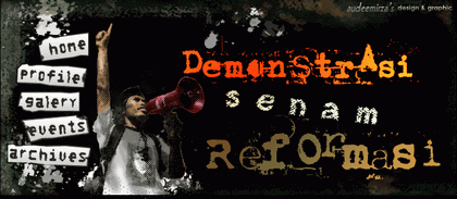
Demonstrasi Senam Reformasi (header design project)
Design Style Tutorial: GRUNGE URBAN ART


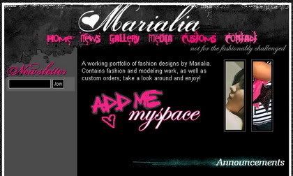
Maria Liaxo

Design Style Tutorial: GRUNGE URBAN ART


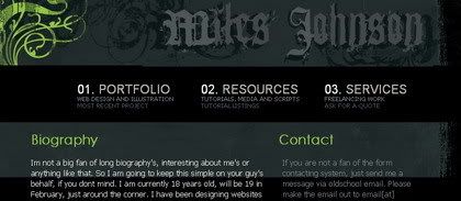
Miles Johnson

Design Style Tutorial: GRUNGE URBAN ART

Friday, January 11, 2008

10 Enhancement Ideas to Optimize your Design Blog Topic

We often read SEO tips for general blogs. I was so curious how to implement those tips and tricks to my design blog topic. Because a design blog niche (like any other niches) always has uniqueness in context, and therefore I always experiment and doing trial and error to improve my blog.
I've seen tons of design blog topics, but not all of them can win the viewer's attention. Creativity in optimization plays important role. My blog is so young and still in the learning process of optimization. However in the middle of that never lasting process, the challenge would always be how to enhance your blog performance. Here are 10 enhancement ideas to optimize your Design Blog Topic:

1. Brings an identity to the blog look
Your logo represents your blog identity. It doesn't have to be a marvelous illustration in style, because a great logo is actually meant deeper than that. Abhinav Sood of InspiritBlog says that
"Logo speaks before words do...And speaks more than words do"


2. Choose design niche content and topic that attract you most and suit your goal:
If you are a design admirer, and love to review sorts of designs, you can post article about:

  • Design review is an introduction to certain design style. Comprehensive review would be better done by profesional designers or doing an interview with the creator. A good example would be: Type for You, that published an article based on the interview with Ricardo Santos.

  • Design Showcase by random favorite, based on poll or survey, etc. Blastyle has been publishing simple design showcase from great graphic designers and it is a great example of a blog design topic. You can also capture a pool result and write a review about it as follows. Learn how LogoBlog Poll, grants an appreciation of Superhero Logos after conducting a survey.

  • Top 5 or Top 50 sorts of design review.
    This kind of writing style is a great way to create intriguing headlines title. Smashing Magazine receives tons of readers and comments using this kind of writing style.

  • As a designer, you can share your expertise to help another designer with new tips hence you can write:
    - Tutorials about design or how to articles. Blog example: Lawny Designz
    - Design software review or write a post about web tool service related to design.
    - Create profesional discussion, or dialogue with the viewers. Blog example: Graphic Design Blog

  • Sometimes blogging is a very good tool to improve a website, because you can also offer commercial services to the visitors, such as:
    - Design services or products. Dennis Plucinik, puts a vertical banner at his sidebar blog, which is a very effective approach to promote design services he's been working on by profession.
    - Profesional design consultation
    - Freelance job listings
    - Design portfolio inclusion. Blog examples: Randay Clay's portfolio and Firewalker


3. Share freebies

  • Designers sometimes need quick design element when dealing with deadline, sharing freebies would help them a lot. Create and share many kinds of freebies like: icons, vectors, buttons, Adobe Photoshop goodies, CSS script, fonts, favicon, skins, web or blog templates, web headers, etc. Blog example: JLW Design. However, freebies are not always in the form of design elements. You can also share other useful resources in the form of E-book and links. Blog example: Veerle's links collection.

  • I thought being different is essential, so I call my freebies as "Free Design Box". I create a button to access my freebies collection and place it at the top (below my headers) hence the viewers find it easily.

  • Interact with your readers for feedback. Broken download links; file size is too big to download; limited download bandwidth and unsupported file format sometimes appear as problems. Prevention step is the best deal. Double check before you launch freebies set.

  • Provide file property data, like: file format, file size in bytes, file compatibility for certain application and version. Bittbox is the perfect example.


4. Visual Dialogues matters

  • Design blog topic, must be able to communicate visually with the viewers. Support the explanation as words and images that collaborate side by side.

  • When you write tutorial and you need to show flat color image thumbnail for it, and GIF is the best choice of web image format. Consider smaller file but persist the quality of the image. If it was photographic, use a JPEG format.

  • If you decide to use free service photo or image hosting, choose the best one that provide various features. There are lots of photo hosting services such as: Photobucket, or Flixya. The good news is, this service can apply tag or label your photos and image, share easily between members and by email if you customize them as public view, and the code script are also available for different purposes. Some services can crop or resize your photo and image instantly. I like this service because, it is free and you don't have to do the re-upload when you need the same image for another post.

  • Create group or forums to discuss and critique each other's design with Flickr. Bittbox User Showcase is an amazing example of a design discussion.


5. Build a small community

  • List the communities that you've joined already, so everyone can easily add you as their friends or invite you to their community

  • Start a group writing project, blog meme or blog carnival to enhance reader's involvement

  • Install a widget from blog forum which provide fresh update for design buzz topic, latest design submission or latest discussion topic related to design (e.g. Digg, BlogCatalog, and Deviant Art).This will encourage your reader to find something different from your blog and show that your blog is always following the news for content.

  • Exchange everything that's useful to your readers (guest posting, comment, useful links, and feed subscription)

  • Give a sincere appreciation and rewards for your visitors and commenters (recent comment widget, link love plug-in, recent visitors widget from your blog forums, top commenters count widget, friend list) so it will increase their blog authority as well as yours. But the important thing is to give them a nice response and thanking for their feedback :)

  • Open a discussion about design related. If you wonder what kind of topic that most talk about among designers, you can try one of these topics:
    1. Share what you've experienced as a profesional designer, such as: dealing with client, searching new ideas, working with partners, freelancers activities, design process troubleshooting, etc.
    2. Post an article about interesting design forums and discuss their advantage features
    3. Complete review about new design gadget or software.
    4. Design Critique
    5. Other unique ideas???? There is nothing better than reading Inspiration Bits that come from another blogger. :)


6. Easy to navigate:
Design Blog niche, is always dealing with many terms about design. Of course you don't want your readers to get lost when browsing your blog do you? There are several ways to create simple navigation system:

  • By default, Wordpress user has the advantage to show label category with the number of post as well as New Blogger Blogspot. Visitors can easily select certain label category to find specific related articles.

  • Using Technorati label, Delicious widgets or Swicky is is just examples of tool that help you to create simple navigation system. I prefer Delicious, since the visitors will have the chance to bookmark my post and add my blog to their network. Technorati labels work almost the same as Delicious, unless it receives your article updates from the automatic pings. However with Delicious, you must do it manually.

  • Design blog topic would generate several different tags or labels for each article. Be sure that this labeling system would help the readers to navigate the whole blog articles. A long trail of tags is not a good idea if you have space limitation in your blog. They would look cluttered and slowing down the readers to find the right tag or label. Avoid labeling article that merely based neither on the title nor to way too specific.

  • Try to include these navigation system elements:
    1. Archive by month; if your blog has been updated since years back, use pull down menu to extract the long link list trails.
    2. Latest post, you can show 5 or 10 recent articles just incase your reader need to access the previous part.
    3. Search box, provide search tool where the user will find it easily.
    4. Menu tab, some bloggers love simple link with different css style headings. But if you want to look different, try to use CSS Tab Menu software, where you can create profesional tab menu. If you decide to use horizontal tab menu, be sure that it won't surpassed your main content width. The result will be awfully cluttered. Instead of that, try to use the vertical sidebar tab menu when you have several web pages to be featured.
    5. Sitemap - it is a hierarchy system where you can guide your visitors to browse your blog.

7. Reciprocal Links

  • Featured article links would be good to arrange as listings of the most favorite articles. N Design, is a good example of a design blog that features its previous article with thumbnail pictures. While Graphic Illustration blog uses different heading styles and color to feature article links.

  • Provide related post or related links from other resources in every article. Related post is a way to invite the viewers to visit another article post, because new updates will slowly bury your previous articles.

8. Protect your blog content

  • Register to online copyright services (e.g. Copyscape, Creative Commons, etc) to get copyright label on your design.

  • Declare the legal usage for everything that belongs to your creativity rights.

  • Preserve your design image or photos using watermark label.


9. Promote your blog
A blog with good content but without maximum attempt of promotion will slowly lost its potential readers. There are easy ways to promote your design blog topic, such as:

  • Provide access to socio bookmark your article that is easy to reach. Placing the widget at the post footer is the most common thing to do. Readers would probably bookmark after finding a good article and share it to their contacts or keep it into their email inbox. So don't loose the chance to promote with a socio bookmarking system

  • Optimize your article feed with Feed Flares if you use FeedBurner to handle feed subscriptions. A must to know about RSS is useful skill to help promote your blog.

  • You can include your blog URL signature at your email footer, and whenever you enter blog forum to comment on a discussion or articles.

  • Online business card exchange is a new web tool to spread your blog identity to another blog using widget. Blast and Entrecard are just examples of the service.

  • Link Submission. Submit your blog to:
    1. Blog Directories: Blog Fusion, My Blog Directory, etc.
    2. Design feed aggregators submission,
    3. Blog forums, there are two type of blog forum. The first one is meant for specific design niche such as Pixel Digest, Graphic Design & Illustration Forum. The second one is general forum with art or design category in it (e.g. DotDashCreate)

10. Provide the right standard web tool

  • Usability:
    1. Search box tool
    2. Slideshow galery
    3. Quick commenting system widget
    4. RSS feed subscription
    5. Email contact
    6. Main menu tabs
    7. About me page
    8. Registration (members, payment)
    9. Socio bookmarking widget
    10. Permanent link

  • Accessibility:
    1. Color contrast for blind color
    2. Programming Script and plugin that works for all different kind of user's platform and tool.
    3. Cross browser CSS links
    4. Alternative tools for the disable, and unsupported browser.

  • Readability:
    1. Set fonts using ems, since pixels have one primary disadvantage: they can't be resized in Internet Explorer. Read I love Typography's post about excellent examples of web typography.
    2. Anticipate layout width for mobile users or viewers with smaller screen resolution.
    3. Be sure that all your images use the alt and title tags so that screen readers for the visually impaired can correctly parse your page:
    < img src="logo.gif" alt="logo" title="logo/" />


Do you have a design blog topic? Is there any other enhancement idea that I missed to mention?

If you like this article, you can subscribe in RSS feed reader or subscribe to Graphic Identity by email